Let’s talk about how to wear prints! Adding prints to your outfit is such an easy way to make your outfit more dynamic, eye catching, and instantly more stylish. But, I know wearing prints can feel intimidating. How do you know what to pair with them? And, how do you pull them off without looking crazy?
Today I’ll give you some tips for how to wear prints, including an easy framework that will make it effortless for you to incorporate more prints into your outfits.
Three Tips for How to Wear Prints Well Without Overthinking It
Tip #1: Let your print be the focal point.
The easiest way to pull off a print is to let that printed piece be the focal point by making the rest of the items in your outfit solid pieces.
I know some of you will be wondering, “But what about pattern mixing?” Sure, that’s an option. But let’s talk basics before we get there. The easiest way to pull off prints and look pulled together is to wear them with all solid pieces.
So, if your skirt is the printed item, pair it with a solid, non-printed top. If your top is the printed piece, pair it with solid bottoms and a solid layer.
Now, which colors you choose for your solid pieces makes a huge difference in your outfit looking pulled together or looking like a hot mess. Which brings me to….
Tip #2: Use color-pulling to create cohesion.
Color-pulling is when you choose a color from the print and incorporate it elsewhere in your outfit. This way, the colors become the unifying thread, creating consistency and cohesion within your outfit.
You can color-pull with colors or neutrals from your print. You can then use those colors in big ways or just in small ways with pops in your accessories and shoes.
Tip #3: Keep it simple and start by pairing your printed piece with a neutral counterpart (in a color from the print)!
Keeping it simple is the easiest way to wear a print. If you are ever unsure, or if you want to be super confident that you can create a great look with your exciting printed piece, don’t overcomplicate it. Pair the print with a basic, neutral piece that’s in a neutral color from the print (utilizing color pulling!).
One of the most common mistakes I see women make is overcomplicating it. I’m often asked, “What can I pair with this new skirt I just bought? I love the print but have no idea how to wear it!” The easiest pairings — that will look AMAZING — will always be a basic top or tank in a neutral color that matches a color in the print.
You can get more creative and wear printed items with beyond-basic pieces and with colors. Most definitely! But, I want you to have this combo down as your default first, like the air you breathe. Because it always works and you won’t have to think hard or think twice about it! THEN, when you’re itching for more, you can get more creative with your combos. It’s still always good to have the basics in your back pocket as your go-to’s, though.
How to Wear Prints and Look Pulled Together
Let’s now look at some examples of how to pull this off!
SIZING: I’m 5’6″ and usually S/M or 6 in clothes and 8.5 to 9 in shoes.

Example #1
These printed pants include navy blue and white. So, using our principles of 1) pairing the printed piece with a solid piece, 2) color-pulling, and 3) starting with a basic neutral, we have a no-brainer combo. You can pair these pants with a white tank or tee or a navy tank or tee. EASY PEASY.
In this example I went for a navy tank. It looks cohesive. It doesn’t look boring, despite wearing an incredibly basic tank on top, because the print is doing all the work of making the outfit look interesting.

Example #2
In this outfit, my top is the printed piece. I paired it with dark wash jeans. For the rest of my outfit, I used color-pulling, as I pulled out the small bits of black from the print and echoed it in my cardigan and shoes. When you utilize color pulling and keep things simple, you can pull together outfits with prints really quickly.

Example #3
Another example of our three principles working together: 1) pair the print with a solid counterpart, 2) color-pulling, 3) keep it simple with a neutral basic. This is another pair of printed pants, this time just black and white. I paired these pants with a simple, basic t-shirt for an easy, but eye-catching outfit. A white tee would look great, too.
But this time, for a pop, I added turquoise earrings to the mix!

Example #4
I want to show you this outfit as well — it’s the same pants as in the previous outfit, but this time with a solid colored top, not a neutral one. This only showcases Tip #1, which is to pair your print with a solid piece. A key to cohesion in this case? Choose a color that matches the tone or intensity of the colors that are in your print.
A quick explanation is that my pants are stark white and stark black, both of which are vivid and vibrant — they’re not dulled or muted in any way. So, I paired them with a color that is also vivid and vibrant, a bright cobalt blue. The intensity levels of the black, white, and cobalt are similar, creating cohesion, even though cobalt is nowhere else in my outfit.
Now, I realize this makes sense to some of you while others of you may need a further breakdown of this. If it makes sense to you, run with it! If not, we discuss this, along with other style concepts, in depth inside the PMT Style Club. Come and join us to sharpen your style know-how!
If you are already a member, you can find a great lesson on matching color intensity, with helpful side-by-side comparisons, in this lesson in the Club Hub.
For the rest of my outfit, I kept it simple and utilized color-pulling with the neutrals: white-ish earrings and black sandals.
➡️ Shop similar top. I wear size S.
➡️ Shop similar pants. I wear size S.
➡️ Shop my denim jacket. I wear size S.

Example #5
Here’s an example with a dress, making sure to keep it simple. The dress has brown and white stripes. When you look at the dress as a whole, brown looks like the dominant color. So, to add contrast and pop to my outfit, I opted to focus on incorporating the other color, white, into my outfit. I ended up with ecru sandals and off-white earrings — close enough!
By the way, my dress is VERY stretchy and comfortable! Comes in tons of colors, HERE. Wearing size S.

Example #6
In this outfit, I paired my printed top with basic pants in a neutral color from the print. In this case, my options were black and white, so I went with black. Then, I grabbed the red from the print and used it in my shoes and accessories to add some more color. Fun, right?
➡️ Shop my earrings.
➡️ Shop my denim jacket. I wear size S.
➡️ Shop similar pants. SOOOOO COMFY!! I wear size 6.
➡️ Shop similar LONGER pants. SOOOOO COMFY ALSO!! I wear size 4. Definitely size down.

Example #7
Here’s an example with a printed graphic tee. I wanted an excuse to wear my statement blazer, so I opted for a printed top that had red in it. For the rest of my outfit, I kept it simple by pulling out the white from the top to finish the rest of my outfit with white shoes and white earrings. It seems so obvious after talking through our principles, but it’s easy to overcomplicate it and wear grey or navy and wonder why things don’t look cohesive. (I’ve seen it happen quite a bit.) Go for the neutrals that are in the print!
➡️ Shop my blazer.
➡️ Shop similar jeans.

Example #8
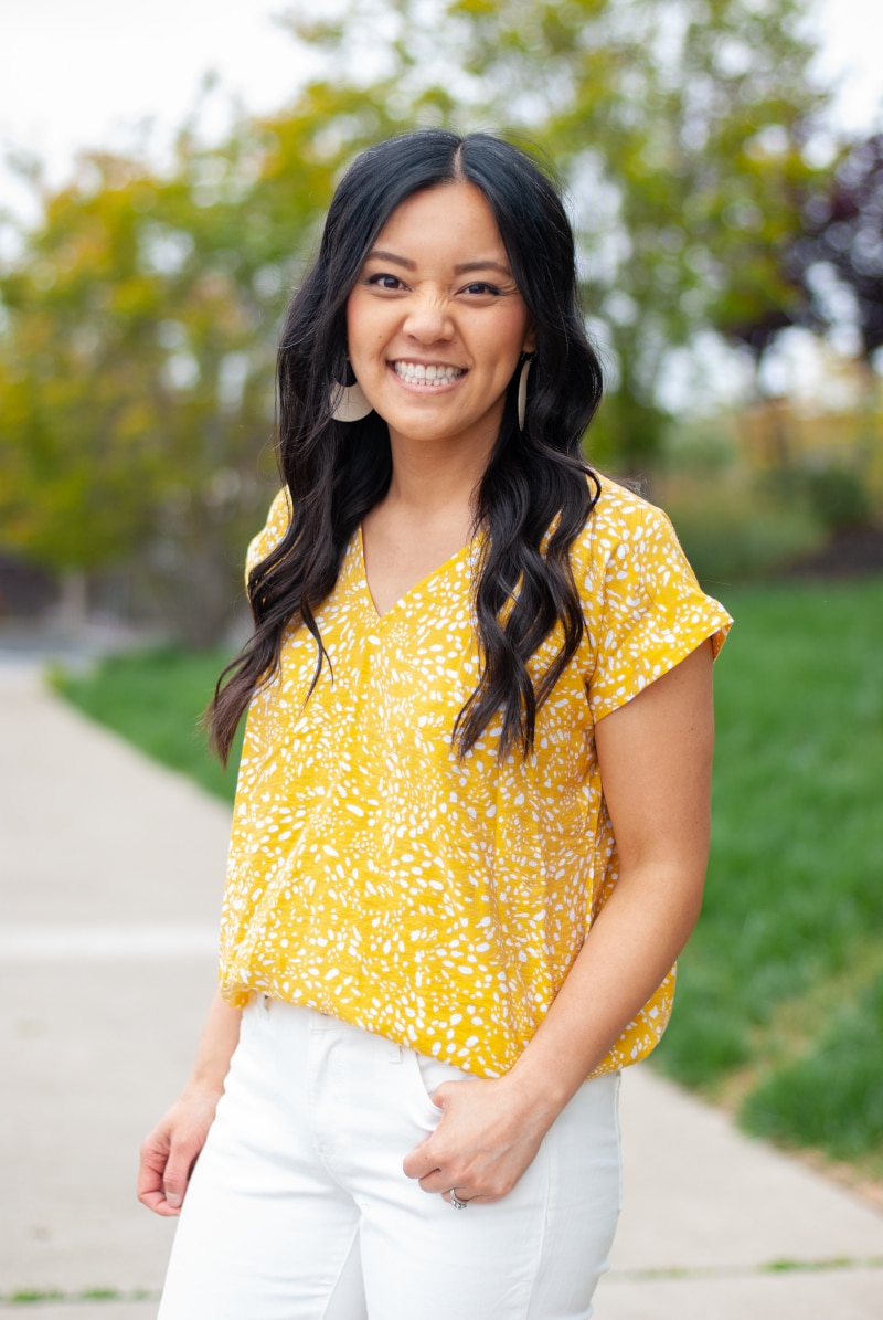
A printed dress like this gives you lots of options to work with! Given that my favorite color is yellow, I took the opportunity to pull yellow from the print and use it in my earrings!
Now, the question of shoes. With a piece like this which doesn’t have obvious neutrals to pull from, what do you do? Well, start with the basics: black or white. I think black would have dragged down this colorful outfit, so I ruled that out. White would have worked pretty well with how bright and fun these colors are. It’s a great option! But, there’s also one category of neutrals we shouldn’t forget because it really comes in handy: metallics! In this case, gold also worked, and I opted for that.
➡️ Shop my dress. Wearing size S. This is VERY breathable but may show some wrinkles, so stick with prints.
➡️ Shop my earrings.
Stick to These Three Tips, and Wearing Prints Will Be Easy
Adding prints to your wardrobe doesn’t have to be complicated or intimidating. By following these three no-brainer tips — letting the print be the focal point, using color-pulling to create cohesion, and pairing your print with a simple neutral piece — you’ll always look polished and stylish without overthinking it!
I hope these tips help you feel confident wearing prints AND doing it with more ease. Don’t be shy about wearing those fun, eye-catching pieces!
Want More Style Tips Like This?
Looking for style tips to feel more pulled together? I’ve got you!
➡️ Check Out All of My Style Tips Posts
➡️ Wearing vs. Styling a Black Sweater — See before and after photos that illustrate the difference a few tweaks can make!
➡️ How to Wear Shoes With Jeans in 4 Different Cuts
Get Personalized Style Help to Feel Great
Want personalized help creating cohesive outfits that you feel great in? Check out the PMT Style Club where we go deeper into styling principles so you can confidently dress for your everyday life, through all the style, body, and life stage changes!

Outfits on Autopilot? Yes Please!
Say goodbye to outfit indecision with the Summer Wardrobe & Outfit Guide — your easy button for getting dressed with confidence and ease.
With the Summer Wardrobe & Outfit Guide, you’ll:
🌞Start each day with ready-to-go outfits (no more staring at your closet)
🌞Feel put-together, even on your most hectic mornings
🌞Make the most of what’s already in your wardrobe
🌞Shop with intention—no more regret buys
🌞Spend less time standing in front of your closet and more time enjoying your day
No-brainer outfits = more time for sipping sparkling water, enjoying the sun, and spontaneous plans!
Grab the Summer Wardrobe & Outfit Guide HERE!